The Good, the Bad, and the Ugly: Bedroom Feature
Every week we feature the good, the bad, and the ugly of real estate photography. This week we’re taking a look at how agents are showcasing the bedrooms within their listings.
Thank you to all of you who have been commenting on the photos— we love to hear your votes and comments on the worst of the worst and the best of the best! Have a great weekend!
WALL OF SHAME
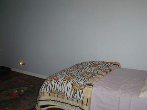
- A Garfield comforter?! SOLD!! Apparently Garfield has selling strengths so powerful there’s no need to actually show the room
 This Illinois home is listed for $359,000.
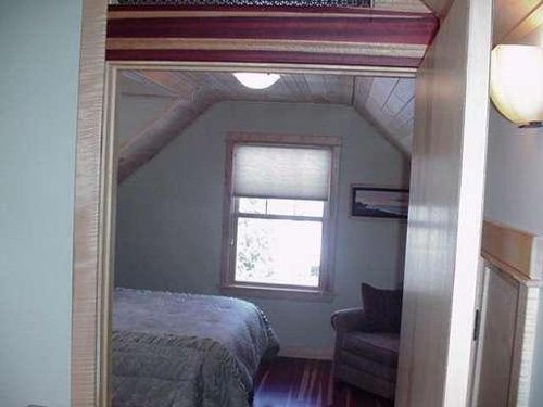
- Well that’s an interesting strategy… maybe if the picture is crooked enough, the room will magically appear larger…or maybe people will be so focused on the fact that it’s crooked, we won’t notice that we can’t see much of the actual room! This Michigan home is listed for $390,000.
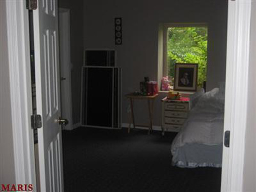
Ok...standing OUTSIDE the room generally doesn't give you a great picture OF the room. And on top of that, to take it with the lights off (with very limited natural light)? Really? This $849,900 listing is located in Missouri.
Now it’s your turn to sound off! Leave a comment telling us which of these photos (top, center, or bottom) you think is the worst and why. We’ll tally up the votes and we’ll post the results of the worst ten photos of the month at the end of each month!
WALL OF FAME
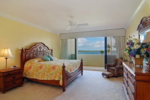
Vibrant colors and a lovely view make this Florida property eye-catching. This property is listed for $569,000 by Sailfish Point Sotheby's International Realty. Click the photograph for more on this listing.
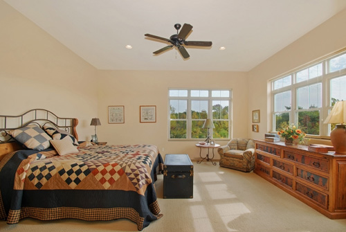
This Wisonsin listing gives a 'comforts of home' feeling in a beautiful tree-lined setting. It is listed for $875,000 by JoAnn Vetter of Coldwell Banker. Click on the photograph for more on this listing.
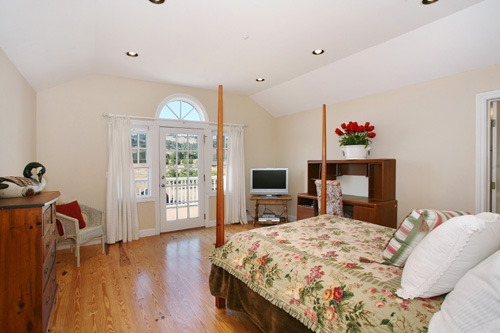
- This bright California home is listed for $1,550,000 by Erick Larson of Sotheby’s International Realty. Click on the photograph for more on this listing.
Sound off! Tell us which of these (top, center, or bottom) you think is the best photograph. We’ll tally up the votes and we’ll post the results of the top ten best photographs of the month at the end of each month!
6 Comments
Comments are closed.


All three of these are great shots. Bedrooms always have a bed dominating all the space so the more floor in the foreground, the better, so I vote for the top image by virtue of more floor visible.
I assume the bottom image was shot in that direction because of the doors opening to an outside patio. Too many pillows on lower right. Probably best to take them out. Less distracting.
Middle image is a close second, but I would try not to clip the lamp. Lamp clipped slightly on top image but not as much.
This is too funny, but let’s be reasonable. The wall of Shame photos, certainly all could do better, but they are also all smaller homes or at least smaller rooms compared to your wall of Fame homes, making it difficult to get better pictures. I can appreciate the crooked picture, because I have tried to take photos of rooms like this and it’s not easy, but hey straigten it out! Pictures from outside the room, they can be useful if you are putting them in a tour of pictures and you show entering the room, of course you need additional pictures of the room to follow. However, Garfield I think won that category. LOL (sorry Garfield)
Wall of Fame – Top photo, I’d add a small beach type chair on the left side of the balcony drapped with a pretty beach towel, or a small table with a beach bag on it, even though you wouldn’t see much of it, and you don’t want to junk up the small balcony, it would invite you to actually use the balcony to enjoy the sun and water, Center photo is nice, don’t know why but it doesn’t knock your socks off, Third photo is great, hard to compete with pretty hardwood floors! I agree, get rid of some of the pillows. Third photo gets my vote.
Great comments! You have a good point– small rooms are difficult to shoot. But I’m not convinced these are all small rooms… are they truly small or do they just look small due to the way they were shot? I do think the crooked photo is of a very small room though (but you’re right, they could have at least straightened it!).
We’re going to be posting photography tips starting this week– I think we’ll start with how to effectively photograph small spaces because, you’re right, it can be very challenging. Stay tuned and thanks again for the comments!
Helpful comments, thank you.
To photograph small rooms I take a wide-angle lense to get the whole room in one shot.
It makes the room look slightly bigger, but at least the viewer gets a better impression.
I agree the 3 top photos are not flattering to put on a website. However, we as experts can consult our clients – and with little rearrangements and pulling the bedsheets straight, a Garfield comforter can also hide in the closet.
I like the 3 bottom photos as they give the impression to walk into the room and also a view what to expect at the outside. When feasible this is ideal.
Best regards
Margret
Hi Leah and all
I’m always amazed at how a seller can accept their professional realtor taking photos like the wall of shame. But i guess sometimes you don’t have much to work with.
My favorite is the bathroom shot with the camode, even better if it’s a 70’s color…….
Gregg, that’s a good point. When a seller hires a realtor, they put themselves into their hands and trust that the commission they’re paying is worth something. If they let the realtor publish inferior images, it’s the seller who’s at fault in the end. I’m accustomed to hearing lots of feedback from the sellers, often overruling the realtor. It goes both ways. Often the realtor is effective and knows best, but sometimes the seller, with big money at stake, will speak up. And I’ll always listen.