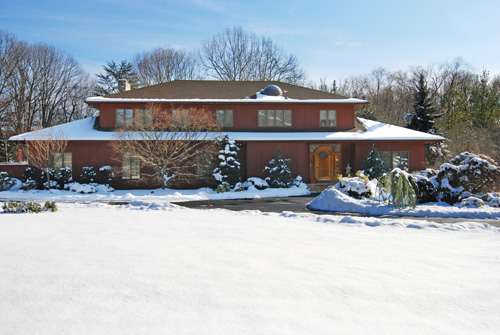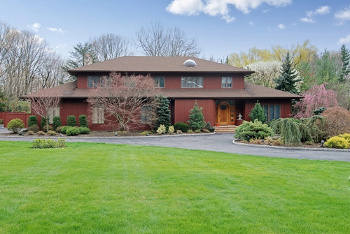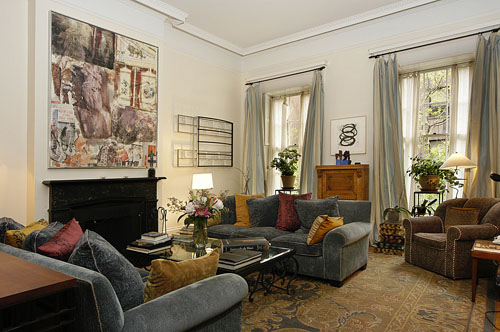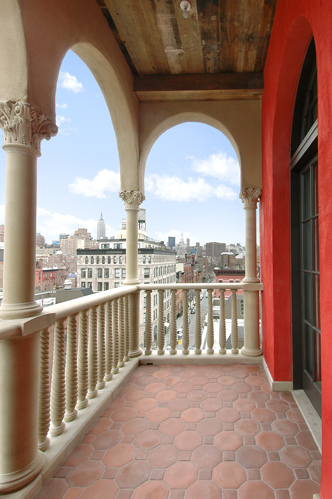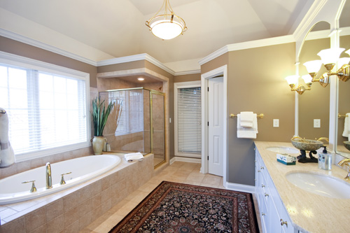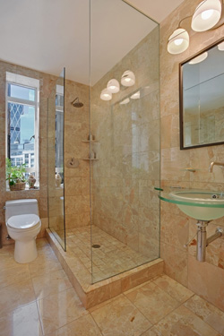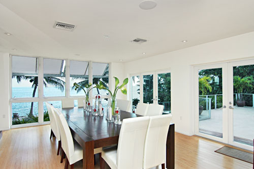
This is a former home of Cher's. Cher was an Emmy Award Winner for Outstanding Variety, Music or Comedy Special for "Cher: The Farewell Tour Live" in 2003. She was also nominated four times for "The Sonny & Cher Comedy Hour" from 1971-1974. At the time of this photograph, it was listed by Jorge Uribe of Sotheby's International Realty. Click on the photograph for more of Cher's home!
5 of the Hottest Pools on the Market

This is so amazing, it doesn't even look real! This home in Boca Raton, FL, is listed for $9,900,000 by Misti Bell of Coldwell Banker. Click the photograph to view more of this listing.

WOW...this gives many resorts a run for their money! This Jupiter, FL, home is listed for $15,500,000 by Lynn Feuerman of the Corcoran Group. Click the photograph to view more of this listing.

Stunning pool and outdoor living area in Alpharetta, Georgia. This home is listed for $5,600,000 by Annemarie Russo of Harry Norman Realtors. There are more great shots of the pool area of this home...click the photograph to see more.

Gorgeous pool in Cape Coral, Florida (love the slide!). This home is listed for $3,145,000 by Richard Schwandt of John R Wood Realtors. Click the photograph to view more great shots of this listing.
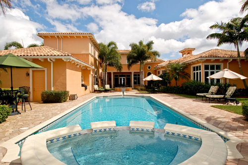
This lovely pool looks like it goes on forever! This home in Boca Raton, FL, is listed for $2,295,000 by Nancy Ghen of Coldwell Banker. Click the photograph for to view more of this listing.
Let us know which was your favorite!
Zillow and Shine (Yahoo) also posted great articles featuring top pools...check them out below! http://www.zillow.com/blog/10-amazing-swimming-pools/2010/07/29/?scid=emm-081010AugBuzz-10amazingpools http://shine.yahoo.com/event/haven/the-worlds-most-spectacular-pools-2217827/#photoViewer=10This week we will be taking a tour through the homes of the Good, the Bad and the Ugly Luxury Edition. One would think that great photography would come with the territory but as our ‘Wall of Shame’ features the bad (…and oh yes, the very ugly…), you will see differently. On the opposite end of the spectrum, our ‘Wall of Fame’ features some of the most stunning photography that you will find for higher end properties. The 'Wall of Fame' captures the essence of the meaning of Luxury. Take note of what great photography can do to enhance your higher end listings and make certain you do not wind up on our 'Luxury Wall of Shame.'
A little side note… on the weeks we’re not featuring the Good, the Bad, and the Ugly, we’ll be providing photography tips designed to help you stay off of the Wall of Shame!NOT SO LUXURIOUS WALL OF SHAME
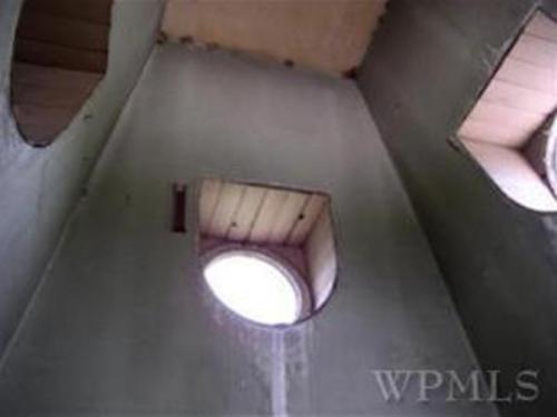
For the next stop on the tour of this $2.1 million New York home, here is the cement room?... Well..., I'm not really sure what this is? Is it a tunnel system? Is it even part of the home? For a Luxury Listing, not sure if I want to spend $2 Million for what appears to be a home that replicates the same architecture as the New York Subway System. Next time, maybe pull back and show what it is that you're shooting.
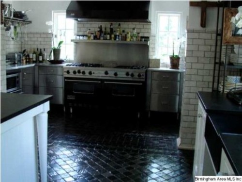 There's a lot wrong with this photo. Where to start...? First off, either the camera is being held crooked or this kitchen is slightly unsound, foundationally speaking. Where does the floor end and the oven begin? Couldn't they have removed the clutter; it kind of ruins the beautiful range that I think they are trying to feature. This Alabama home is listed at $3,899,900.
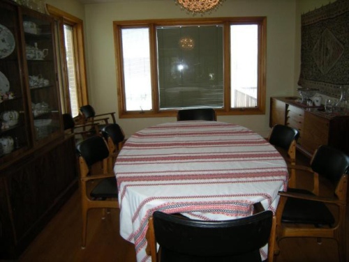
I don't get the point of this photograph. If you have this wonderful water front property with stunning views why would you shoot this dining room with the blinds closed. It doesn't really showcase the home in it's best light. Also, look out for the 1980's Christmas tree Ornament for a chandelier. I don't know if this really helps showcase what probably is a great $2.1 million Virginia home.
Now it’s your turn to sound off! Tell us which of these (top, center, or bottom) you feel is the worst and why!WALL OF LUXURY!
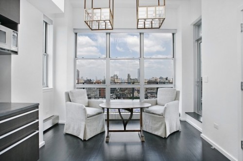 How would you like to cozy up to a cup of coffee in the Breakfast Area of this property?
This New York luxury listing was listed at $3.5 Million by Andrew Anderson of Prudential Douglas Elliman.
Click the photograph to view more of this listing.
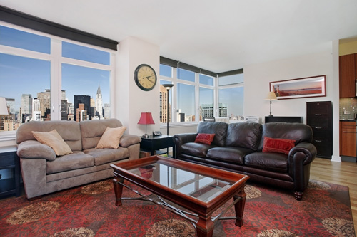
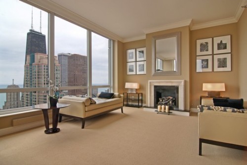 You get a stunning view of the John Hancock Building in this Chicago properties Master Suite.
This listing is listed at $3.6Mil by Margaret Baczkowski of Atproperties. Click the photograph to view more of this listing.
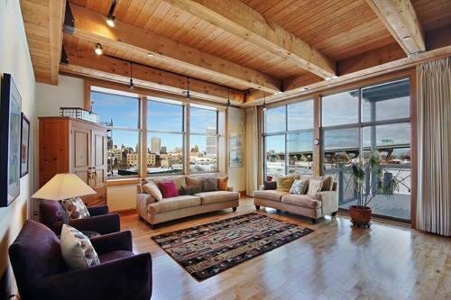
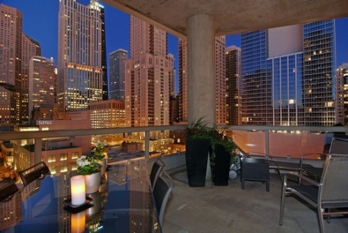 How about entertaining a few guests with this view? The beautiful view is from a Chicago home
listed by Maureen Moran of Prudential Rubloff for $3,165,000. Now, that's what I call a luxuirous view!
Click the photograph to view more of this listing.
Let us know what you think! Which of these (top, center, or bottom) do you think is the best and why?
WALL OF SHAME
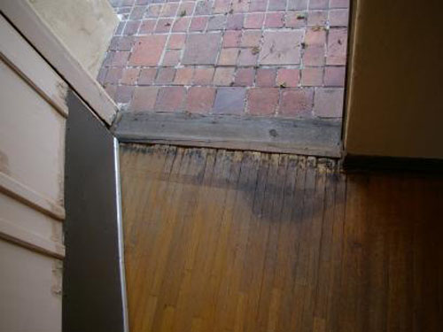
Showcasing beautiful hardwood floors is great...zooming in on a damaged, dirty (and maybe even a little moldy) hardwood floor is not so great. This is a $950,000 listing in California.
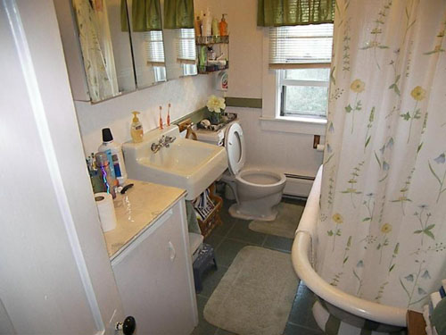
We couldn't just do a little light staging before taking this one? I mean, at the very least, putting the toilet seat down so it doesn't look so 'freshly used'??...but maybe also putting that new roll of toilet paper on that's just sitting there and temporarily hiding the hundreds of products they have lying around to avoid highlighting the lack of space/storage? This is a $389,900 listing in New Hampshire.
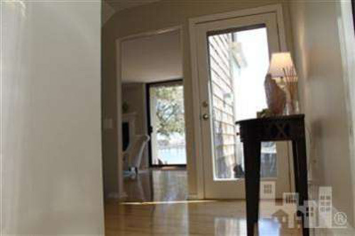
Hmmm...not sure why we're on the floor here... it's not helping to give any additional perspective or view of the space...this view just puts the focus on the hall table. And also not so sure that previewing the property at this level is the most natural feeling...this was taken so low, we're eye-level with the little kitty who seems to want inside 🙂 This is a $649,900 listing in North Carolina
WALL OF FAME
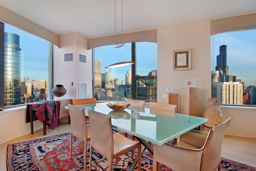
Amazing views beautifully showcased in this Chicago condo. This home is listed for $999,000 by Robert Anderson of Baird & Warner. Please click the photograph to view more stunning photographs of this listing.
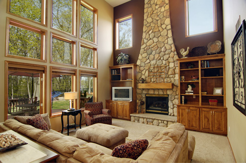
This living room showcases both floor to ceiling windows and a beautiful stone fireplace. This Minnesota home is listed for $475,000 by Tony Trout of Edina Realty. Please click the photograph to view more of this listing.
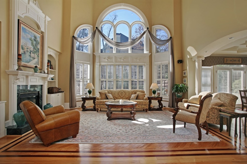
The great room of this Georgia home has been beautifully photographed, really emphasizing the large space and the great amount of light brought in by those lovely windows. This home is listed for $875,000 by Randy Gottschalk of Coldwell Banker Atlanta. Please click the photograph to view more of this listing.
With this series we take a look at the Good, the Bad, and the Ugly of real estate photography. Our ‘Wall of Shame’ features the bad (…and oh yes, the very ugly…) photos that some agents are using for their listings. On the opposite end of the spectrum, our ‘Wall of Fame’ features some of the most stunning photography agents are currently using to market their listings.
A little side note… on the weeks we’re not featuring the Good, the Bad, and the Ugly, we’ll be providing photography tips designed to help you stay off of the Wall of Shame!WALL OF SHAME
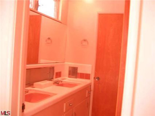
Oh my-- a triple threat-- crooked, over exposed, and taken in a way that makes a small room look tiny. Yikes! I think I probably would have re-taken this or just not posted it at all... it's not doing much to help market the home. This is a $719,000 listing in California
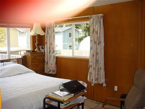
LOL! I just get such a kick out of 'thumb shots'... can't resist posting them to the Wall of Shame...it's the classic bad photo 🙂 This is a $290,000 listing in Washington

Cute dogs... but I doubt they'll make a 'splash' with potential buyers expecting to actually see pictures of a house!! 😉 And that's not to mention that the date on the photograph is 2008... and we found this online recently! This is a $765,000 lisitng in Nevada.
Sound off! Tell us which of these (top, center, or bottom) you think is the worst and why!
WALL OF FAME
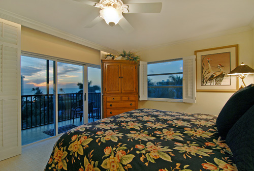
This bedroom is beautifully photographed, really highlighting that AMAZING view! This Florida home is listed for $495,900 by Judy Hansen of Coldwell Banker. Click the photograph to view more of this listing.
WALL OF SHAME
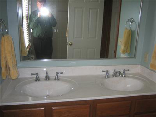
Love that he doesn't even try to hide...it's as though the mirror isn't even there! This is a $199,950 listing in Ohio
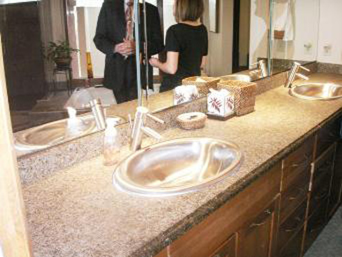
Really? You couldn't just ask them to move for a second? This is an $850,000 listing in Missouri
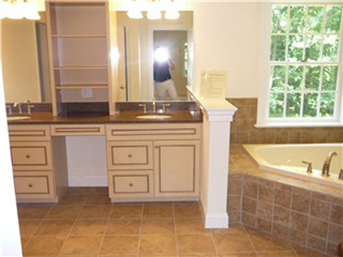
LOL! Maybe leaning will help? Not so much! This is a $749,000 listing in Pennsylvania
WALL OF FAME
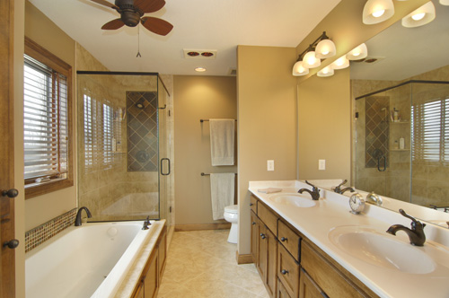
This Minnesota home is listed for $399,900 by Lisa Erickson of Edina Realty. Please click the photograph to view more of this listing.
