With this series we take a look at the Good, the Bad, and the Ugly of real estate photography. Our ‘Wall of Shame’ features the bad (…and oh yes, the very ugly…) photos that some agents are using for their listings. On the opposite end of the spectrum, our ‘Wall of Fame’ features some of the most stunning photography agents are currently using to market their listings.
A little side note... on the weeks we're not featuring the Good, the Bad, and the Ugly, we'll be providing photography tips designed to help you stay off of the Wall of Shame! 🙂WALL OF SHAME
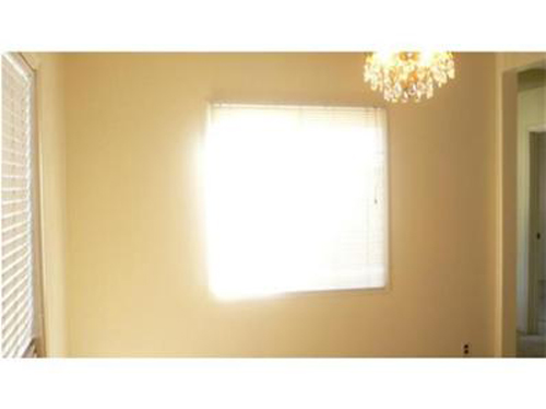
It was definitely a bright, bright sun shiny day in California the day this was taken! Not shooting directly at the window would definitely help when photographing this $499,000 listing.
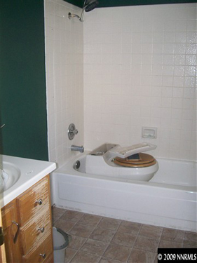
Ok, fairly certain that doesn't belong there...and that having it there wouldn't be a huge selling feature. So why focus the photo directly on it (or take a picture of it at all for that matter)?? This is a $125,000 listing in Nevada.
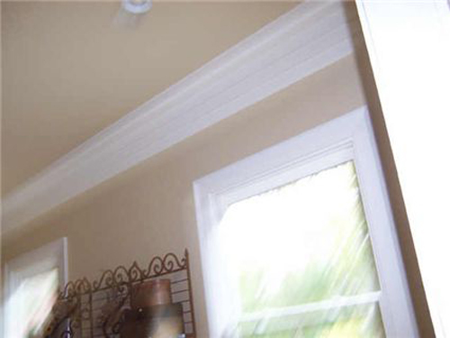
Not sure if the camera was dropped while snapping this shot or if the agent was running through the room while taking it (lol!)... but I think it's safe to say this probably isn't the best way to showcase this $1,299,000 listing in Georgia
Now it's your turn to sound off! Tell us which of these (top, center, or bottom) you think is the worst and why!
WALL OF FAME
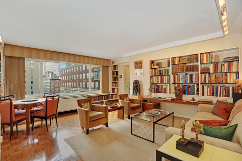
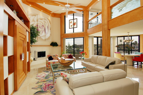
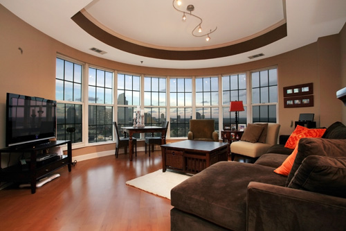
This beautiful home in NYC is listed for $525,000 by Froso Beys of The Corcoran Group. Please click the photograph to view more of this listing.
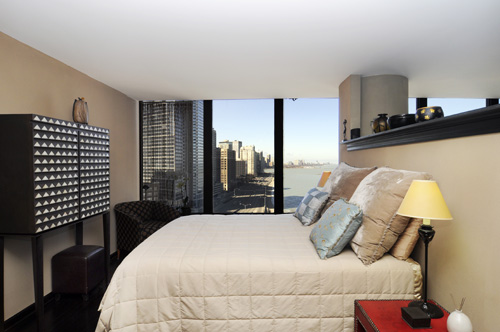
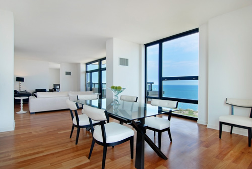
They've taken a smaller space and have made it look spacious and attractive with a great (and very clear) presentation of that never-ending view down Lake Shore Drive! This home is listed for $319,999 by Jean Ward of Chicago Lakefront Properties. Please click the photograph to view more of this listing.
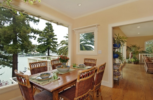
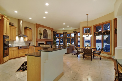
This dining area is beautifully captured, really highlighting the great selling features of this $1,850,000 home. This property is listed by Janet Williamson of Frank Howard Allen. Please click the photograph to view more of this listing.
Tell us what you think! Let us know which of these (top, center or bottom) you think is the best and why!
WALL OF SHAME
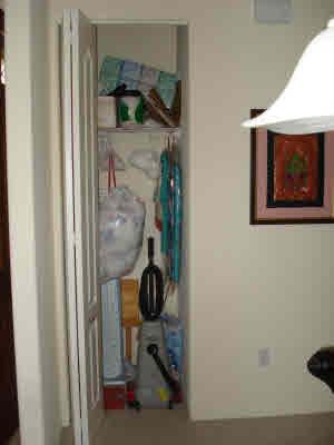
Yes, lets focus on the tiny, crowded closet... buyers aren't looking for a lot of closet space anyway, right? 😉 Seriously, why not just shut the door (or better yet, skip this all around bad photo all together!). This is a $404,000 listing in Hawaii.
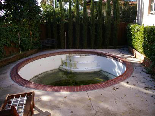
LOL! Ok, I get that hot tubs are a selling point... but really?... a close-up of that nasty green water is looking far removed from a relaxing spa...more like a huge, gross headache! This is a $950,000 listing in California
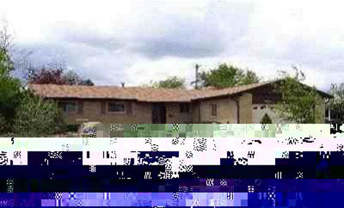
Oh my. We get that things sometimes happen that prevent some photos from coming out exactly right. But there's no excuse for actually uploading it and KEEPING it there, looking like THAT, to market a listing (and in case you're wondering, no this is NOT a foreclosure)! This is a $235,500 listing in Colorado.
WALL OF FAME
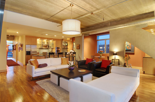
WOW! Gorgeous photography marketing this Minnesota home. It is listed for $675,000 by Dennis Flahave of Edina Realty. Click the photograph to view more of this listing.
Every other week we'll be featuring the good, the bad, and the ugly of real estate photography. Our ‘Wall of Shame’ features the bad (…and oh yes, the very ugly…) photos that some agents are using for their listings. On the opposite end of the spectrum, our ‘Wall of Fame’ features some of the most stunning photography agents are currently using to market their listings.
A little side note... on the weeks we're not featuring the Good, the Bad, and the Ugly, we'll be providing photography tips designed to help you stay off of the Wall of Shame! 🙂
WALL OF SHAME

Shooting this photo of the master bath with a focus on the door more than the actual room or any of its features probably won't have buyers begging for a showing...the room most likely looks much smaller than it probably is and from the small glimpse of the bathroom features we do see, they look pretty nice, so why not show it off the right way? This is a $579,000 listing in Illinois

This is one of those "why even bother" photos that we see all too often... but if you're going to bother shooting this and actually posting it to the MLS, you should maybe try to at least get far enough up the stairs so they're not the focal point of the photo! This is a $699,900 listing in Tennessee

LOL!! Love how the seller is just hangin' out, waiting for the photo to be taken so he can get back to packing or cleaning or whatever it is that he's doing. Shooting the kitchen WITHOUT featuring the seller, or whoever that is, is probably a better way to market this $1,299,000 Georgia listing
WALL OF FAME
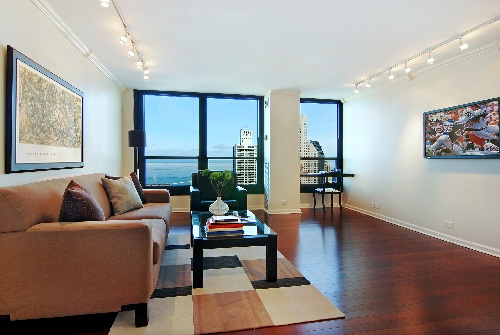
The view and hardwood floors are beautifully showcased in this Chicago condo. This $229,000 home is listed by Tracy Dillard of Koenig & Strey. Click the photograph to view more of this listing.
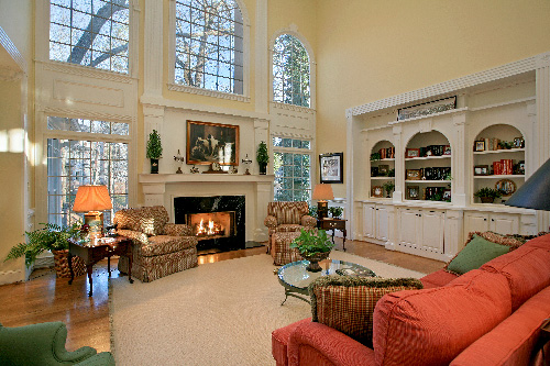
This Georgia home features a stunning living room with floor to ceiling windows. It is listed for $649,000 by Randy Gottschalk of Coldwell Banker Atlanta. Click the photograph to view more of this listing.
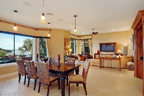
Wow-- the open layout between the 'breakfast nook' and living area in this luxury Florida home (not to mention all the great windows!) are showcased in a way sure to attract luxury buyers. It is listed for $4,200,000 in Stuart, Florida, by Sailfish Point- Sothebys. Click the photograph to view more of this listing.
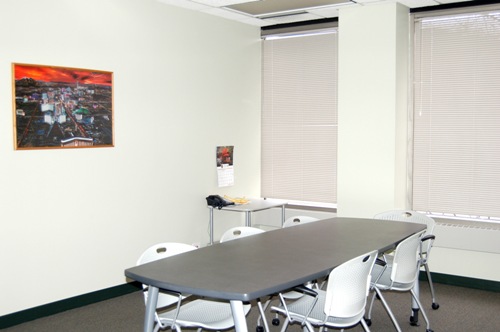
(Conference Room shot using normal flash settings)
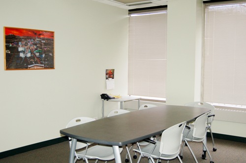
(Same shot using a coffee filter as the diffuser)
If you look at the samples, the differences are not outwardly apparent. By looking at the back of the chair that is in the forefront of the photo you can see with normal flash the blown out effect and the opposite with the shot with the diffuser. The walls also act as reflectors that can send back a lot of light and with the diffuser the shot appears more warm and natural. The diffuser works wonders for rooms that may have a lot of reflective surfaces.
Here's my tip of the week. Hope it helps. Try this technique and let me know what you think. If you have any questions feel free to comment and I can hopefully answer any questions you have.
WALL OF SHAME
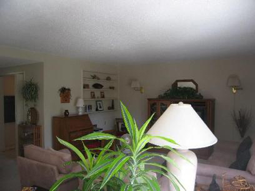
What's hiding behind that lamp and plant? Oh... it's a living room! This is a $365,500 listing in California
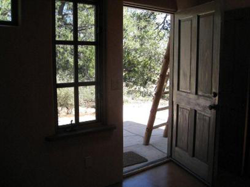
Wow...not sure what the thought was behind this picture (though I guess that's pretty common with our wall of shame posts :)). You're not seeing much of the outside (and from what you can see, it doesn't appear that there's much going on out there), and you're definitely not seeing any of the inside! This home lists for $349,000 in New Mexico.
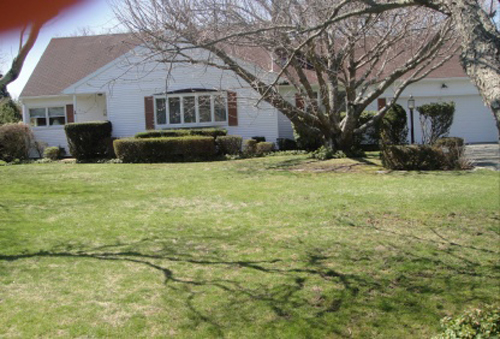
Oh my... a crooked photo complete with a thumb in the upper left corner... probably not the best way to market this $999,000 Long Island listing!
WALL OF FAME
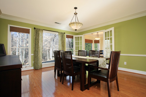
Beautiful photography really helps set this Georgia listing a part from the rest. Love that they captured the view of the trees in this lovely dining room. This home is listed for $279,000 by Roy Crook of Coldwell Banker Atlanta.
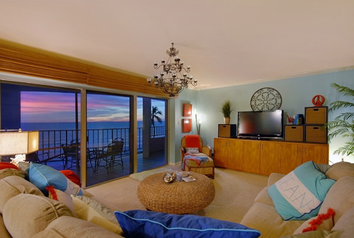
WOW! Talk about a stunning view! Showcasing the view in this way really makes an impact. This Florida home is listed for $675,000 by Judy Hansen of Coldwell Banker.
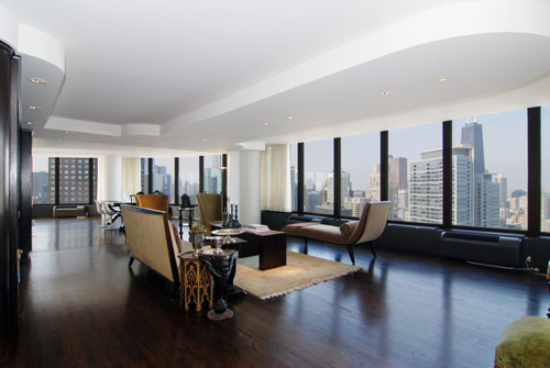
This gorgeous Chicago condo (which, like our other two Wall of Fame posts this week, is complete with amazing views) is listed for $1,895,000 by Jeff Lowe of Prudential Rubloff Properties.
Top 5 Luxury Properties of 2009

This stunning Naples, Florida, home was listed by Frank Petras of John R Wood for $7,999,500. Click the photograph to view more of this listing.
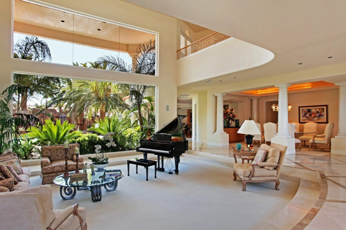
This beautiful Las Vegas home was listed by Shapiro & Sher of the Prudential Americana Group for $4,050,000. Click the photograph to view more of this listing.
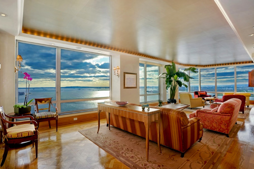
Floor to ceiling windows and an amazing view really bring this New York home to life! This property was listed by Jon Capobianco of The Corcoran Group for $6,500,000. Click the photograph to view more of this listing.
- Auto Level - With the click of the button you can correct the color levels of your photographs. Typically, this will make your colors appear their true color.
- Auto Contrast - With one simple click, the contrast and mixture of your colors is corrected.
- Sharpen - This will sharpen the focus of fuzzy/blurry areas in your photos. Be careful not to use too much of this tool, or your photo will start to look like a cartoon and will come out extra grainy.
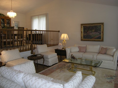
Things look a little dim.
Things are looking a little better and brighter these days!
In my opinion, Photoscape, while not for the beginner in most aspects, has taken the cake for best free photo editing software. As I just mentioned, the con of Photoscape is that the organization and photo management tools are not as straight forward as some of the other programs I have looked at. Check out PhotoScape and tell me what you think. I'm sure you'll be pleased with the results.

