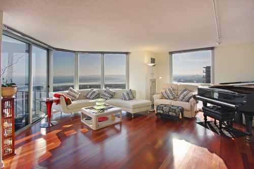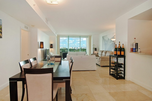
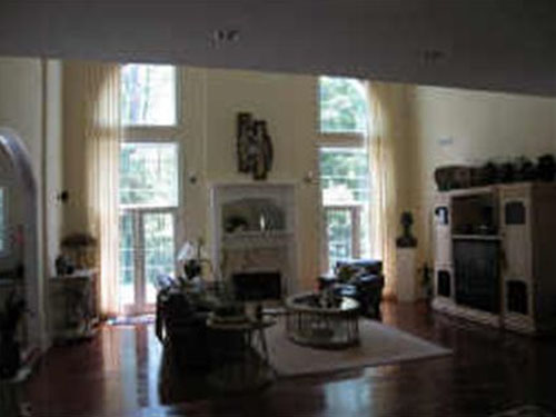
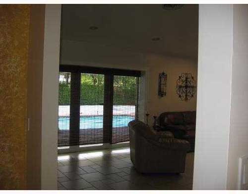
It's such a shame to not showcase a beautiful room like this with such great windows in a way that will attract buyers. This one really misses the mark...not only has it been shot too far away and directly at the large windows, making them appear very bright and the rest of the room appear a little darker, but it is also very blurry-- not a good way to attract luxury buyers. This is a $1,999,999 listing in Georgia.

I think they actually got down to the level of the dogs to make sure they included them in the shot!! Pretty dogs...but to make them the focus of the photo seems as though they're doing the seller a bit of a disservice...potential buyers would I'm sure be much more attracted to the lovely living room than the large dogs that the sellers own. This is an $850,000 listing in California.
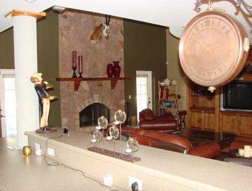
Here's another one where the living room should be the main focus of the photo--not the clock, the candles, the statue, the wires, and the counter. Taking this on the other side of the counter would have been a much better idea. This is a $1,399,000 listing in Florida.

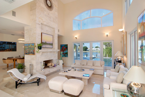
A gorgeous room with fantastic windows, showcased in a way sure to grab the attention of luxury buyers. This Florida home is listed by Burt Minkoff of Corcoran for $2,749,000.
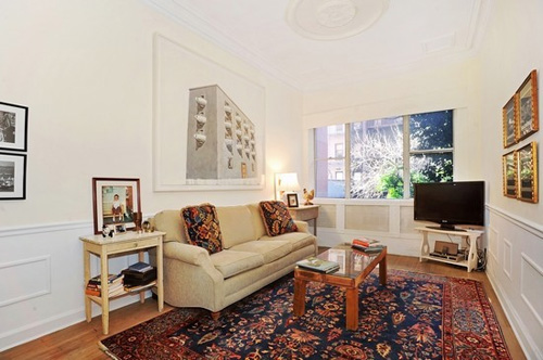
This lovely New York home is listed for $499,900 by Jon Amundsen of Citi Habitats.
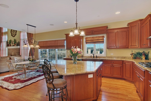
The lovely kitchen and the open layout of this Glen Ellyn, Illinois, home is beautifully showcased in this photograph. This home is listed by Laura Weidner of Baird and Warner for $800,000.
This week on my free photo editing software tip, I thought I’d take a look at the free site Photoshop.com, which is Adobe’s attempt at a free photography management and editing tool. You can access the website from anywhere that you have internet access, making it conveniently portable. You do have to sign up for an account with the site but the sign up process is pretty quick and painless.
After getting set up, you will find the upload tool on the My Library screen. Here is where you would upload the images you would like to edit. When you get your image pulled up, below you will find the “Edit” tab. There are 3 Categories of Edit tools: Basic, Adjustments, and Advanced. Just like with Picasa, the Advanced tools are used to make more flashy/artistic edits.
The Basic category will do for most edits one will need. Here you will find the Crop/Straighten tool, the Auto correction tool, and the exposure tool, among other options. The Adjustments include Highlight, Fill Light and the Sharpen tools.The cool thing about this site is that for most edit options that you select, the site presents you with multiple versions of the edit, typically 5 or 6. This is an interesting concept because it allows for subjectivity. Some people tend to like images cooler (more blue) and others prefer warmer (more red/yellow-ish).
- The crop and resizing tool worked easily. The Crop tool was nice, in that, there was no restriction on the give and take of cropping out parts of the image. Some tools that have a crop option only allow you to crop so much of the photo.
- The “auto-correct” can also be useful. It does most of the work for you.
- The Exposure button is pretty nifty. It acts like the exposure dial on your camera. Plus, the site offers you 6 exposure options; three of the exposure are darker and three are lighter than the original.
- There is also a resize tool that offers some template sizes or allows you to custom size the photograph. This comes in handy when you need to size your photos to put up on the web, which there is a template selection for website sized photos.
- The Highlights and Fill Light can brighten up some of your darker exposures. Be careful not to go overboar
Here are two photographs, from a DIYer, that I edited using Photohop.com.
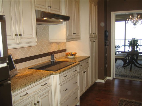 This is the original. It appears dark and look at those dust spots.
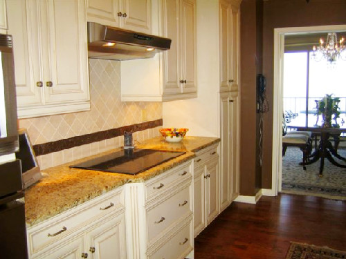 TaDa! The kitchen is now ready to be cooked in!
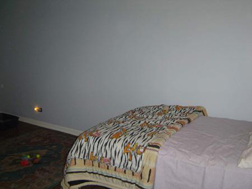
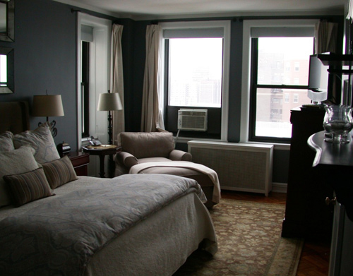 You can barely see this beautiful bedroom.
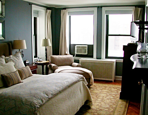
Voila! Now you can see.
There is one thing I failed to mention that I think is my favorite option on the site. The “View Original” button allows you to go back to your original image and compare that to what you have edited thus far. At any point you click that button it will flash the original photo, letting you see what great work you have done!
Overall, for free software, Adobe did well. It’s definitely no Photoshop. It is nice that this tool is online. The photos are available for access anywhere (you have internet access) at anytime. The downside to being online is that it’s a little slower than a desktop app would be since it’s not hosted on your machine; therefore performance is based on your internet connection.
Check out Photoshop.com and tell me what you think.
WALL OF SHAME
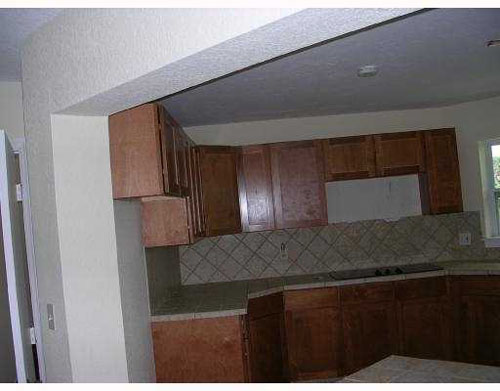
Wow. I think the only semi-nice thing I can say about this is that at least it's not too blurry (though it is definitely not the sharpest!)...but other than that...it's dark, crooked, and only shows a sliver of one of the most important rooms of the house!! Not the greatest way to market this $800,000 listing in Florida
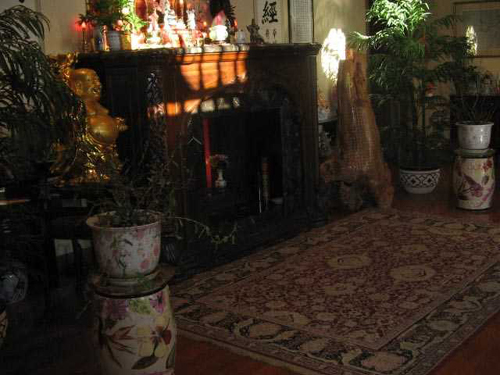
I think they were maybe trying to showcase the fireplace? Maybe? Unfortunately you don't really see the fireplace...or the room...just a whole lot of 'stuff' in a dark little space. This is an $895,000 listing in West Virginia.
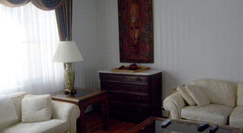
By shooting just the corner of this room, focusing more on the furniture than the space, it ends up looking much smaller than it probably is. This is a $489,000 listing in New York.
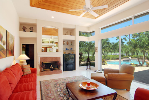
This stunning Florida home is sure to grab the attention of potential buyers. It is listed for $724,000 by John Harry of Illustrated Properties.
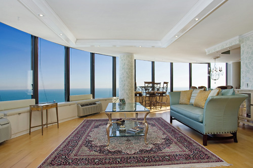
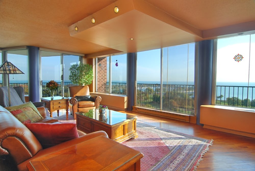
This gorgeous luxury condo on Lake Shore Drive features large windows and beautiful lake views. It is listed for $925,000 by Mont Wickham of Conlon in Chicago, IL.
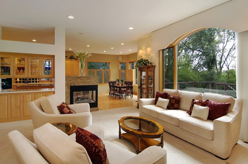
A nice open layout is showcased in this lovely Minnesota home. It is listed for $535,000 by Jarrod Peterson of Edina Realty.
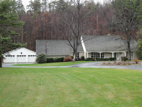
Before editing the colors look a bit dull
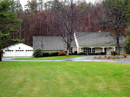
After editing in Picasa the photo is looking brighter, sharper, and has more contrast
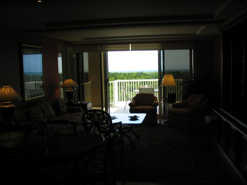
This agent-shot photo is very dark-- you're unable to really see the room at all, just the balcony opening and a shadow of the chair in front of it. As you can see, they seemed to be shooting directly at the window.
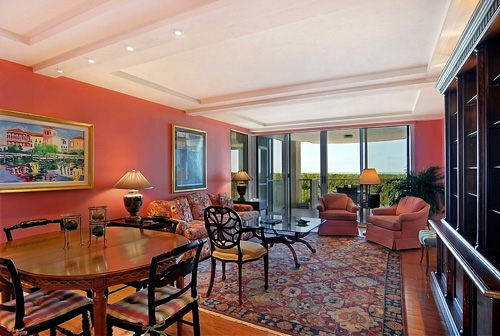
VHT re-photographed the listing. Though the window is still in the shot, the camera is shooting more toward the wall and the corner of the room.
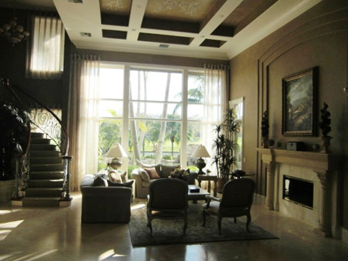
This agent shot photo is again pointed directly at the large window and no lights were turned on when taking the photo.

VHT re-photographed the listing, shooting more toward the corner of the room (as well as turning on a few of the lights before taking the photograph)
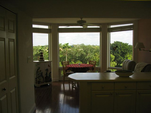
This one is again shooting directly at the window with no lights on. It gives a clear shot of the view from the window, but doesn't do anything for the kitchen or breakfast nook that potential buyers would probably also like to see.
![6849_Grenadier_Blvd_Unit_504_Kitchen[1]_RB VHT re-photographed the listing, turning on the lights and pointing the camera more toward the wall and corner than directly at the window](http://resnapshot.vht.com/wp-content/uploads/2009/12/6849_Grenadier_Blvd_Unit_504_Kitchen1_RB.jpg)
VHT re-photographed the listing, turning on the lights and pointing the camera more toward the wall and corner rather than directly at the window
WALL OF SHAME

REALLY?! I almost thought this was a joke when I first saw it. I mean, come on... Nothing says 'nice landscaping' like an enormous thumb?! And is that a traffic cone on the right?? This shot was posted to market a $1,650,000 listing in California
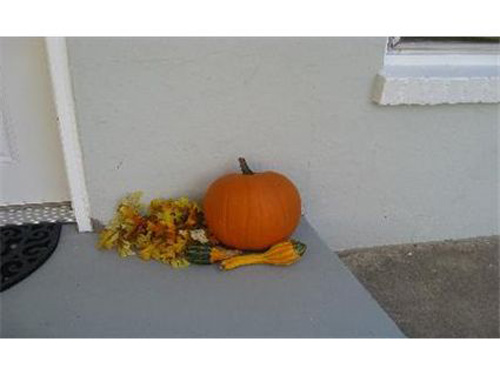
Are pumpkins a great selling feature? No? Huh. Might be nicer to see the pumpkins as an accent to the front entry way...actually seeing the front entry way being the key of course. This was posted to market a $169,900 listing in Colorado

Ok, these rocks aren't even pretty...not sure why we're focusing on them...especially instead of the house? If it's a pond that comes with the house, great,but why not show the entire pond...would probably be more attractive to buyers than a close-up of rocks? This is marketing a $315,000 listing in Michigan
WALL OF FAME
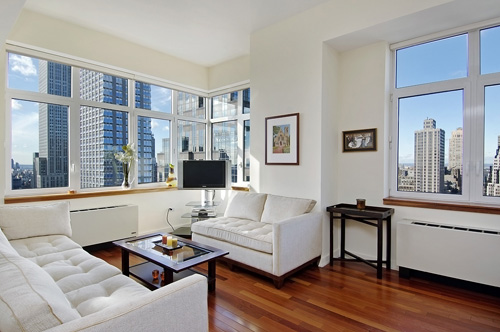
This stunning 5th Avenue luxury condo is listed for $1,275,000 by Karen Giaquinto of Prudential Douglas Elliman in New York.
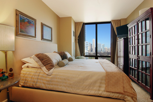
This Chicago condo features gorgeous skyline views. It is listed by Vera Perner of Coldwell Banker for $500,000.
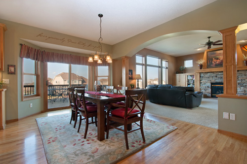
This beautiful Minnesota home is listed for $549,900 by Al Strand of Edina Realty.
WALL OF SHAME
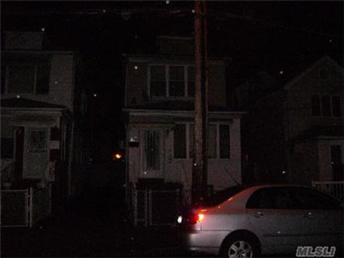
That is one dark street! Probably not the best time of day to take a picture...even a night shot needs a little light (or at least some lights on in the house!). This home is listed for $389,000 in Long Island, New York.
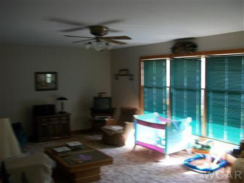
Ok, that's a bright color on the windows, but it's not enough to save this dark (and blurry) photo. This Michigan home is listed for $630,000.
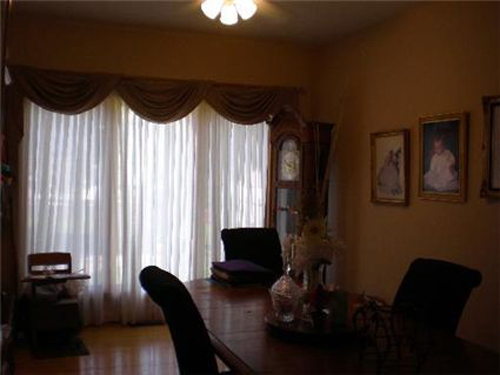
Showcasing this dining room with a darker photo probably won't give potential buyers warm and happy thoughts of future family dinners. This Illinois home is listed for $499,900.

Night shots can be stunning and incredibly effective when done right! This gorgeous shot is a model home (new construction) in Texas, listed by Kathryn Castellanos of Builder Homesite, Inc. No list price was provded, but similar homes in the development started at $261,990. Click the photograph above for more information on this listing.
Aspect Ratios and Sizing Your Photos
When sizing your photos, always preserve the aspect ratio of the photo. This is the ratio between the width and height of a photo. If you don’t do this your images will be stretched or smashed.
If you're using Photoshop, you can easily maintain aspect ratios by clicking "constrain proportions" in the Image Size tab (under 'Image' in the top navigation). For those of you not using Photoshop, stay tuned... we'll be posting some tips using free editing software in future weeks!
When using photos for the web, it’s best to re-size your photos in a photo editing software program to the exact size needed (also maintaining the aspect ratio!) to avoid any distortion that can be caused by having the webpage forcing the photo to a certain size. Below are a few examples of this-- these are photos we found on real estate websites that have been stretched to fit a certain space (and weren't re-sized beforehand to appropriately fit that space)...
 We’ll go into more detail on preserving aspect ratios and proper sizing in future weeks…

#5 comes from Week 9 of our Wall of Shame
#4 comes from Week 7 of our Wall of Shame
#3 also comes from Week 9 of our Wall of Shame
#2 comes from Week 8 of our Wall of Shame

And our #1 Worst Photo of the Month comes from Week 8. Though a lovely yellow lab, it doesn't do much to market the listing in that it isn't showcasing the actual home the buyers would be purchasing


#5 comes from Week 8 of our Wall of Fame
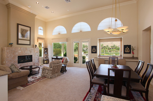
#4 comes from Week 9 of our Wall of Fame
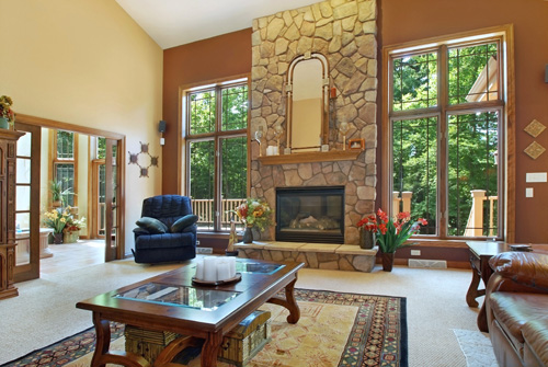
#3 comes from Week 7 of our Wall of Fame
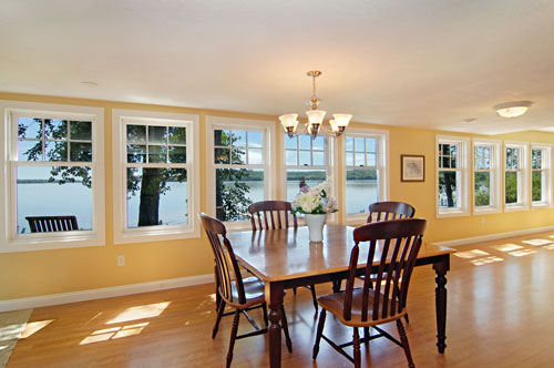
#2 comes from Week 9 of our Wall of Fame
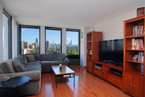
Our #1 Best Photograph of the Month comes from Week 7 of our Wall of Fame
WALL OF SHAME

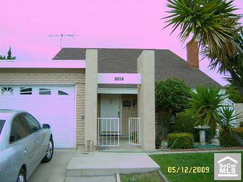
- WOW!! Very PINK... Photoshop was not this person's friend... sometimes less is more when using photo editing software! This California home is listed for $409,000.

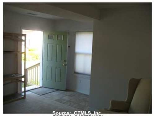
- Hmmm...well being that we can't read any of that, I'm thinking just showcasing an open folder and a dining room table probably isn't going to excite anyone enough to call for a showing. This $689,000 listing is located in Connecticut.

Looks like it would be a beautiful room...bummer that we can't actually see it! This Florida home is listed for $750,000.
WALL OF FAME
This beautiful Chicago condo is listed for $369,900 by Janet Stier of Baird and Warner.

This Minnesota home, complete with beautiful lake views, is listed by Deb Grimme of Edina Realty for $449,900.

This gorgeous home is listed for $829,990 by Heidi Kasama of Windermere in Las Vegas, Nevada.


