Photography Tip of the Week
Here are 3 easy tips to making a small room look bigger…
1. Use the “3 Walls” Rule…
Including 3 walls in your composition helps show more dimension to a room by helping the viewer seem they are actually in the space. Compositions with only 2 walls also tend to focus on furniture. Remember you’re selling the space, not the dresser!
If you’re shooting a super small space (like a smaller bathroom) and you are unable to capture three walls due to the tight quarters, two walls are always better than one.
2. Try shooting at a slight angle….
When shooting at a slight angle to a room, the lines of the room help create visual depth to the room. This helps make the room look longer by adding perspective.
3. Use a Wide Angle Lens…
Wide Angle Lenses do just what they sound like they would.. they capture a wider view of the space. Wide angle lenses have been in Real Estate Photographer’s bag of tricks for a long time for this very reason.
Examples of using the 3 tips (the first photograph of each set is a shot not using the 3 tips, the second photograph applies the 3 tips)…
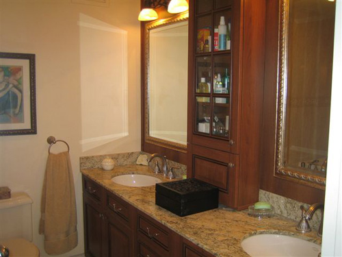
- This is an actual agent photo as seen on an MLS. Certainly not the worst photo we’ve seen, but it could use a little help. Though this appears as though it would be a little larger than the ‘typical’ bathroom, the way this is shot gives the feeling that the space might be a little tighter than it truly is.
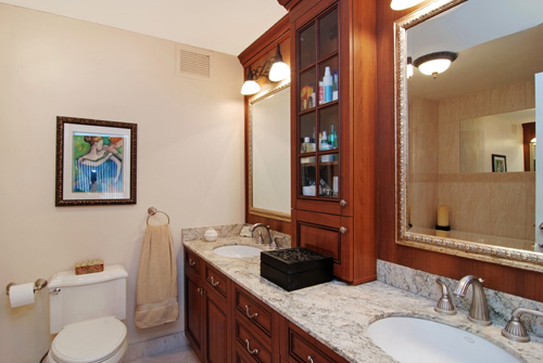
VHT's professional photographers contacted the listing agent for the above property and re-photographed the same listing. As you can see, the wide angle lens helps a great deal in opening up the space, as does shooting at slightly more of an angle. If you look in the mirror you'll see that they've also captured part of the shower in the shot, opening things up even further. They've also made a point to capture part of the ceiling and a glimpse of the floor.
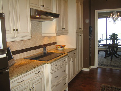
Here is another actual photo taken by an agent. Again, a very nice kitchen, far from being the smallest space we've seen. However, with the way this is shot, you get no feel for the size of the actual room...you're only seeing the cabinets and backsplash. Though those are nice, it would be even better to show them off while also showcasing the actual room itself.

Here again, VHT photographers contacted the listing agent and re-photographed the property. By capturing more walls and using a wide angle lens, they're able to showcase the entire room-- beautiful cabinets, backsplash, and now even appliances and floors included! They again also captured the ceiling, giving the room some height and really opening things up a bit.
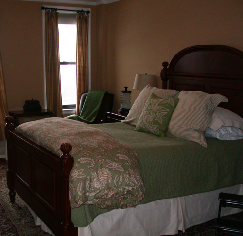
This agent-shot bedroom appears small due to the focus on the large bed
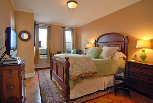
By applying the three tips above, when VHT re-photographed the listing, the bedroom appears much larger
We realize the ‘every day’ listing will probably have much tighter spaces than the examples we’ve shown here, but by applying these 3 easy tips, you’re sure to give your listing a larger, more open feel that will be more attractive to potential buyers browsing online.


