The Good, the Bad, and the Ugly
WALL OF SHAME
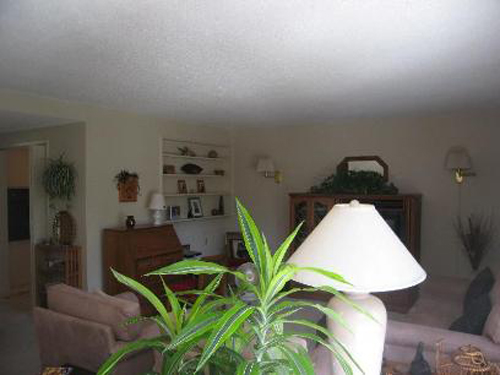
What's hiding behind that lamp and plant? Oh... it's a living room! This is a $365,500 listing in California
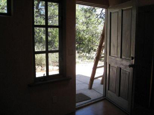
Wow...not sure what the thought was behind this picture (though I guess that's pretty common with our wall of shame posts :)). You're not seeing much of the outside (and from what you can see, it doesn't appear that there's much going on out there), and you're definitely not seeing any of the inside! This home lists for $349,000 in New Mexico.
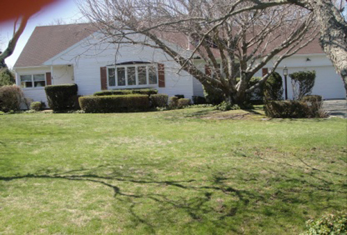
Oh my... a crooked photo complete with a thumb in the upper left corner... probably not the best way to market this $999,000 Long Island listing!
WALL OF FAME
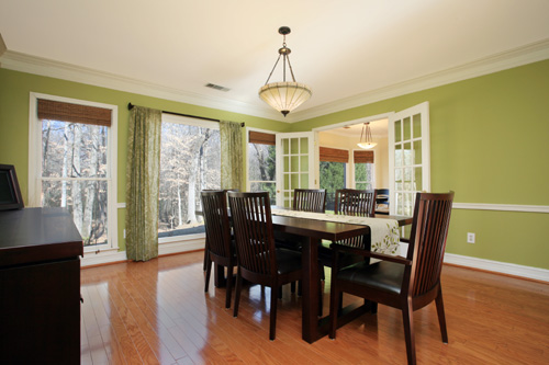
Beautiful photography really helps set this Georgia listing a part from the rest. Love that they captured the view of the trees in this lovely dining room. This home is listed for $279,000 by Roy Crook of Coldwell Banker Atlanta.
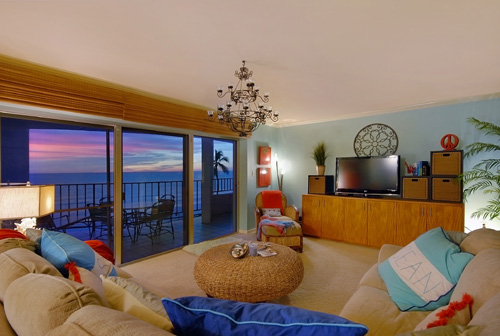
WOW! Talk about a stunning view! Showcasing the view in this way really makes an impact. This Florida home is listed for $675,000 by Judy Hansen of Coldwell Banker.
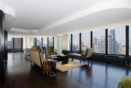
This gorgeous Chicago condo (which, like our other two Wall of Fame posts this week, is complete with amazing views) is listed for $1,895,000 by Jeff Lowe of Prudential Rubloff Properties.
One Comment
Comments are closed.


I would have picked the center photograph as the best photo because of the stunning sunset view, but the blue pillow “underlining” the coffee table at the bottom of this image forces me to put this image in third place. The Chicago condo gets 1st place and the Georgia gets second place.
In the Shame category, it’s a toss for worst between the “thumb” photo and the photo of the plant/lamp for first; both are equally flawed. I guess the center photo is an “art” photo-third place.